This page contains a dynamic scatterplot which will load new data as you proceed though the page. These updates will be announced in accordance to your screen reader's implementation of aria-region live.
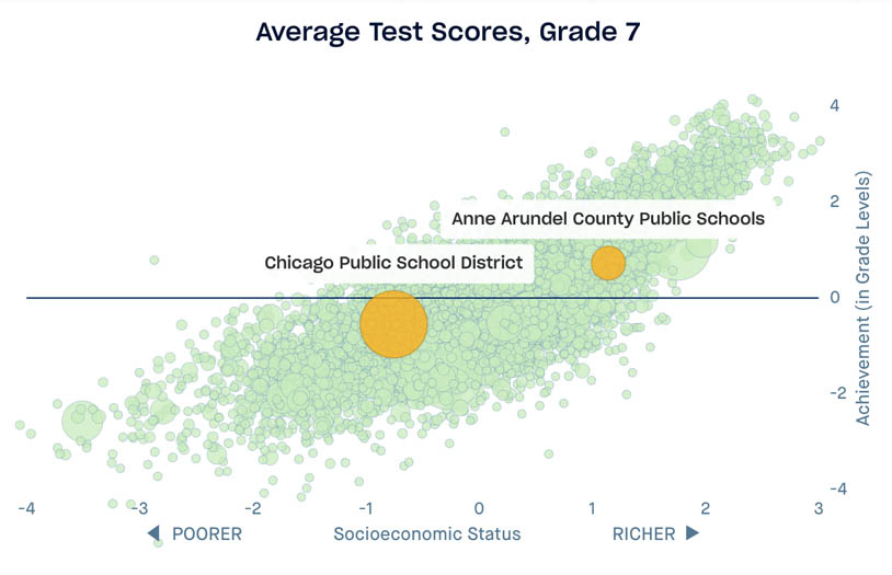
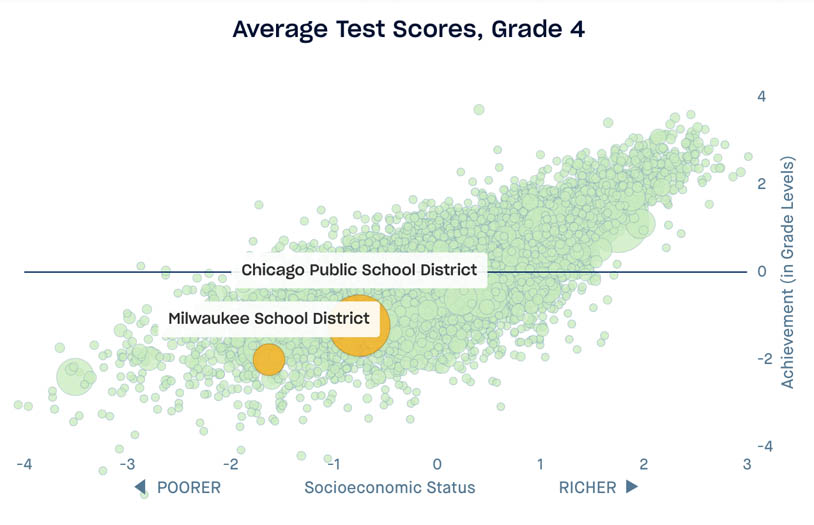
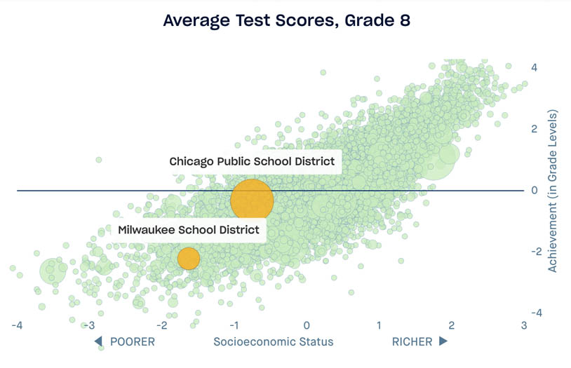
The Chicago Public Schools are more successful than they are given credit for. In 3rd grade, where our test-score data begin, the average student in Chicago scores below a 2nd-grade level, as shown in the accompanying chart.
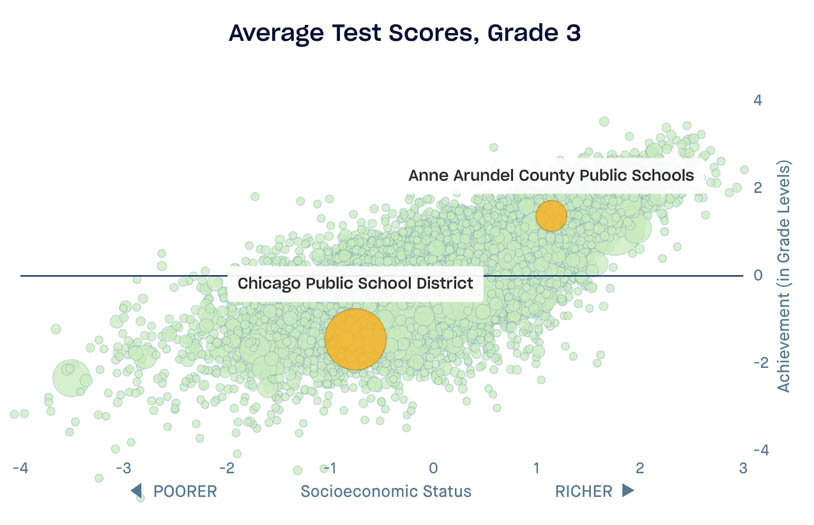
This figure highlights the relationship between how rich a district is and how its students perform on standardized tests in 3rd grade. The horizontal axis shows the average family socioeconomic status (SES) in the district (see here for how we measure SES), where 0 represents the SES of the average district in the United States. More affluent districts are located to the right in the figure; poorer districts to the left.
In many ways the pattern shown here is not surprising: children’s scores are much higher in richer districts. For example, in relatively affluent Anne Arundel County, Maryland, average test scores are well above average in 3rd grade. In Chicago, by contrast, scores are far below average …
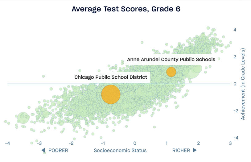
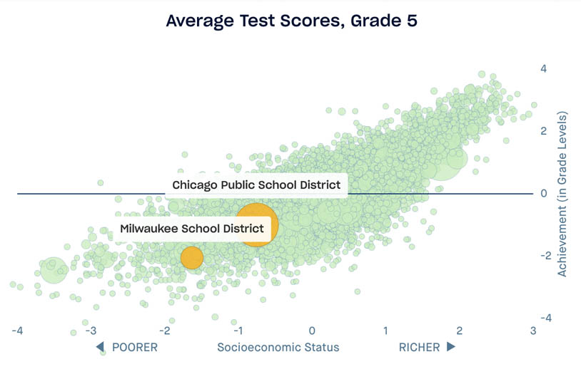
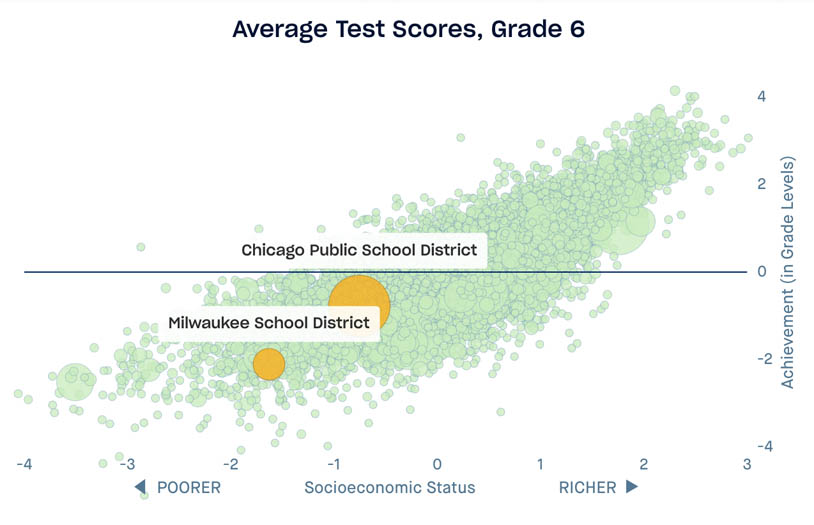
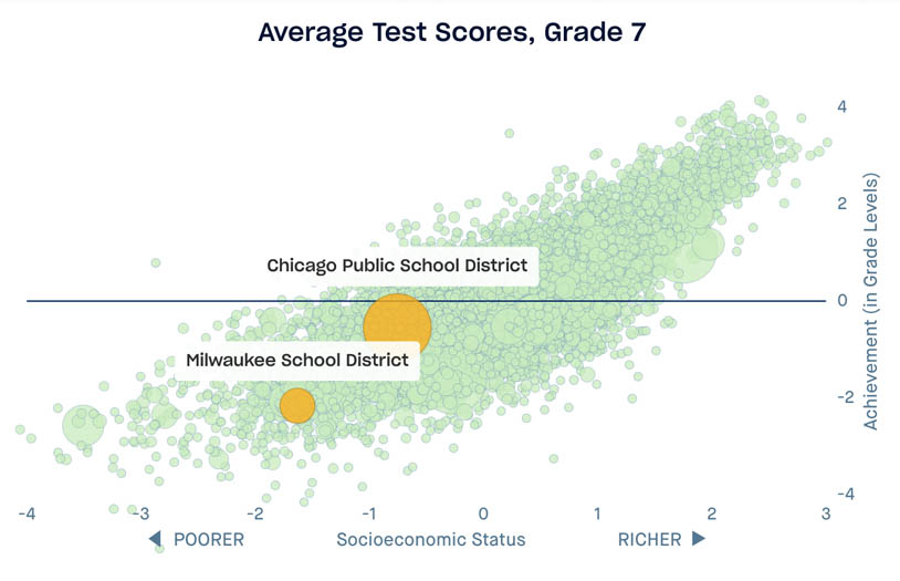
… and by 8th grade, Chicago students perform near the national average. They have experienced the equivalent of six years of average learning in the five years between 3rd and 8th grade. The families in Chicago’s public schools tend to be lower in socioeconomic status, and the average test scores are relatively modest, but, year after year, the schools are lifting children up at an impressive rate.
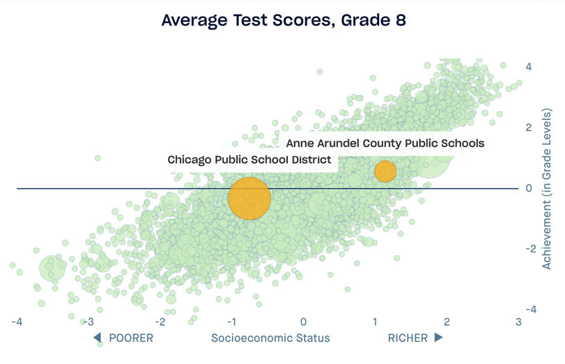
In Anne Arundel, the opposite is true. Although students there are more affluent than average and score above a 4th-grade level in 3rd grade, they learn at a far lower rate than their Chicago peers. By 8th grade their scores are only slightly above average.
It’s common to think of average test scores as a measure of school quality. After all, if students are scoring well on tests, they must be learning something, right?
To understand what is wrong with this assumption, consider a hospital. We shouldn’t assess a hospital based on the health of its patients; rather, we should ask how much a patient’s health improves as a result of his or her time in that hospital. Similarly, we shouldn’t evaluate a school based on the average scores of its students, but rather by how much students learn while in school. If we can measure the change in test scores as students move from one grade to the next, we gain a more accurate picture of what a school is accomplishing.
The Opportunity Explorer provides this data—the “learning rate”—for schools, school districts, and counties across the country. The result is an unexpected story of the quality of public education in the United States. We see, for example, that students in some relatively affluent districts—like Anne Arundel County—show less progress as they move from one grade to the next. We discover, too, that students in some poor districts start off testing far below average, but that the schools appear to be doing an outstanding job, where students are catching up to and exceeding the national average.
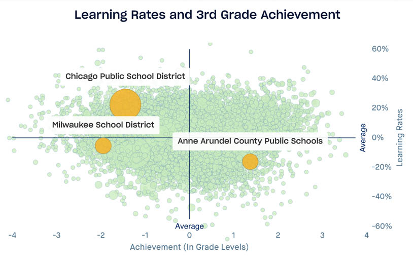
This figure highlights the relationship between how rich a district is and how fast its students learn on average. As before, the horizontal axis shows the average SES in the district. But here the vertical axis represents district learning rates: the higher the district is located in the figure, the faster test scores improve from one grade to the next.
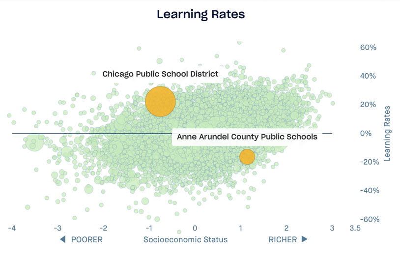
On average, learning rates are modestly higher in more affluent districts than in less affluent ones, but the data reveal many exceptions. Chicago boasts a learning rate 22 percent above average, while Anne Arundel County has learning rates 16 percent slower than average.
Differences in learning rates add up. In Milwaukee, the scores of 3rd graders are similar to those of their peers in Chicago. But over time, their scores do not grow as much, so they are far behind the national average when they reach 8th grade.
Shown here is 3rd grade …
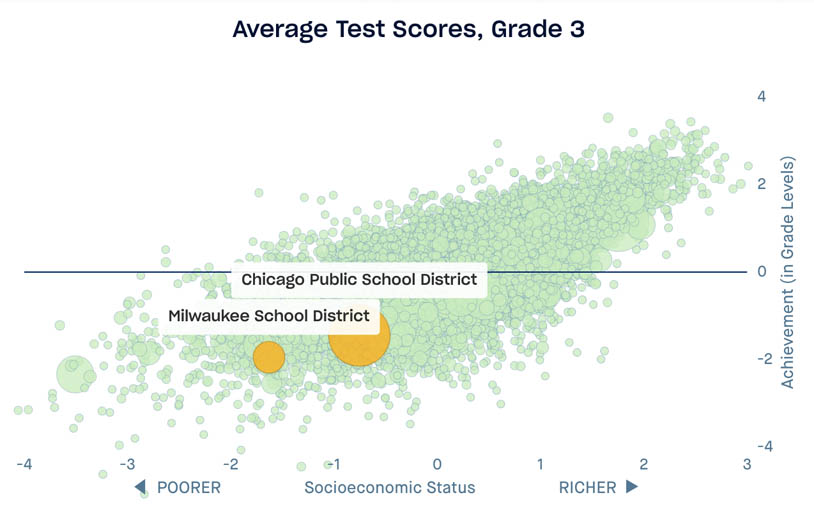
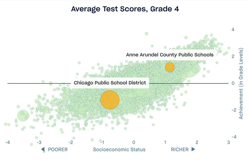
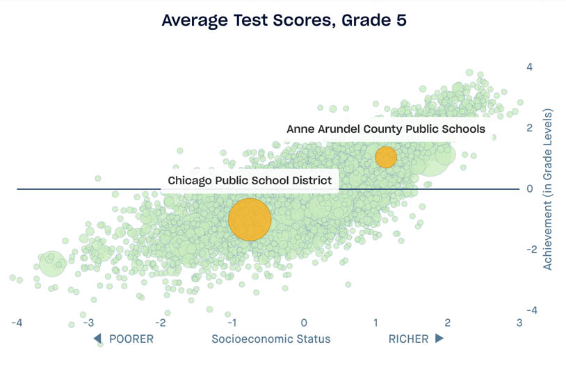
And 8th grade.
Are the schools themselves the reason for this discrepancy in learning rates? It’s possible that other factors, such as family resources and/or the availability of after-school programs within a given district, play some role. But even so, we gain a better idea of how much students learn during their school years by looking at learning rates instead of average test scores. This brings us a step closer to understanding where public schools are most effective at providing learning opportunities. The quality of public education can vary dramatically from one school system to the next, and not in the way that average test scores suggest.
In Chicago, at least, educational opportunities may be limited in one part of children’s lives (from birth to 3rd grade), but may nonetheless be abundant in another period (in late elementary and middle school). Is Chicago an anomaly? Do communities generally provide high educational opportunities at all ages, or low opportunities at all ages? Are places where children learn a lot early in childhood also the places where they tend to learn the most during their later schooling years? Or are many places like Chicago—able to provide more opportunities in some periods of childhood but fewer in others?
Again, the data provide an answer.
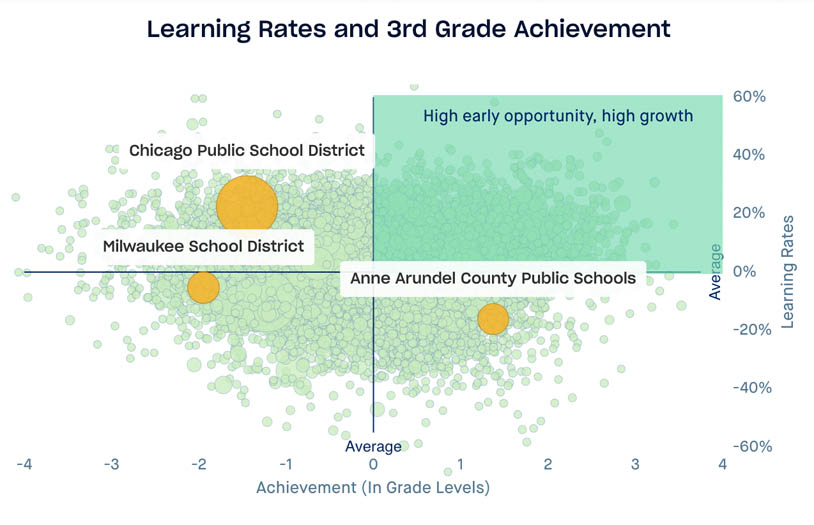
This figure compares district learning rates with average test scores in 3rd grade. As before, districts higher in the figure have higher learning rates. In places on the left, students have had relatively few educational opportunities by the time they reach 3rd grade. On the right side, early educational opportunities are high.
There is almost no relationship between the two measures. Districts with high scores in Grade 3 don’t necessarily have high learning rates; nor do districts with low initial scores generally have low growth rates.
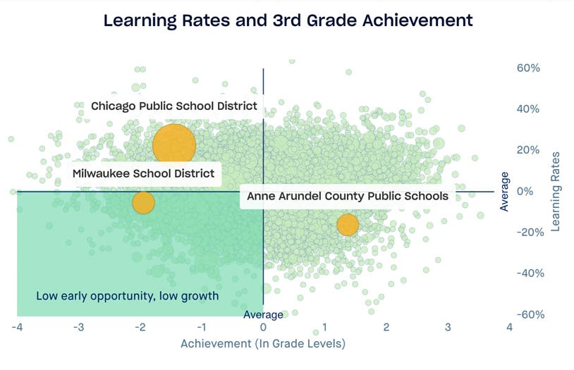
Those in the lower left show the opposite: educational opportunities are scarce both in early childhood and through the middle-school years.
More generally, the data tell us not only where there is more or less educational opportunity, but when opportunity is available in each place.
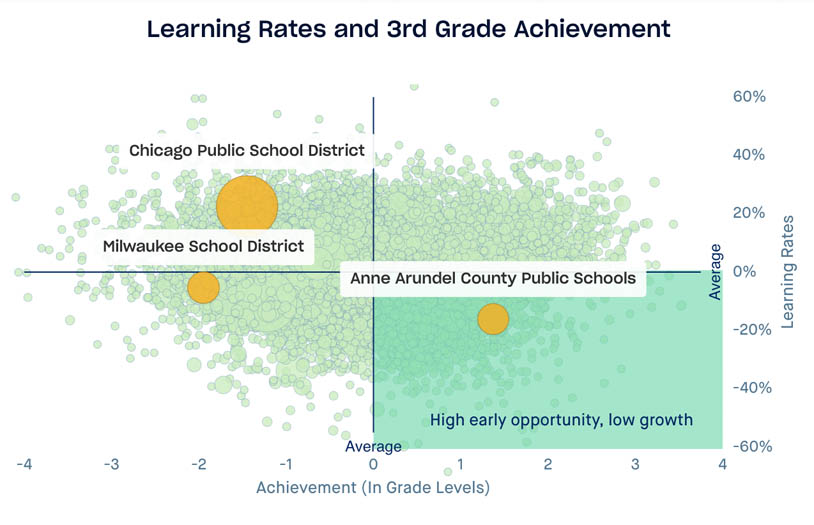
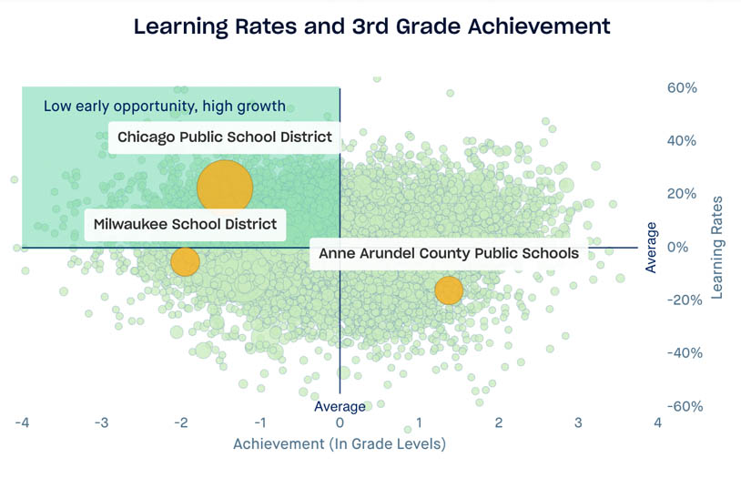
In the upper left are districts like Chicago, where educational opportunities are concentrated during the schooling years. Here children have few opportunities early on, but show substantial learning after Grade 3. Children in such places may benefit from investments focused on improving early-childhood opportunities.
If we want to improve educational outcomes, we will need to change how—and where and when—we provide educational opportunities throughout children’s lives. Some people assume that we simply need to improve schools. Others argue that the schools are fine, but that we need to provide more learning opportunities in early childhood—in children’s homes and child-care centers and preschool programs. The data show that there may be no one best strategy. Rather we need targeted strategies—targeted to specific age groups in specific places—to allow all our children to reach their full potential, regardless of where they grow up.
Published September 2019 with SEDA 3.0 data.
Suggested Citation: Reardon, S. F. (2019). Affluent schools are not always the best schools [Data Discovery by The Educational Opportunity Project]. https://edopportunity.org/discoveries/affluent-schools-are-not-always-best/